PuzzleCeption
A downloadable game for Windows and macOS
FIRSTLY this is an alpha prototype... I just want to see how people feel about the mechanics.
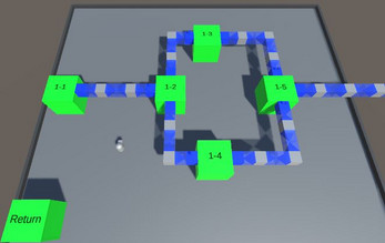
This is a game I have been working on for a while, using a few common puzzles and combining them, both having pieces activate each other as well as some pieces controlling the shape, size etc of each other. The levels as of now are somewhat all over the place.
I am not great at aesthetics, the game is mostly cubes and spheres right now.
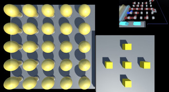
The main 3 puzzles used are pushing blocks, connect the pipes and turn on all the lights... I am trying to combine their mechanics in every way possible to make one big game from multiple smaller ones.
This game has autosave, it will save your level progress as you play for if you need a break.
As of now there are 30 levels plus the tutorials... I have more ideas for levels, I just wanted to make sure this idea was likable.
Last thing of note, the game likes to keep an aspect ratio, changing your screen size will make it snap to the aspect ratio in question after about a second.
This game has keyboard and mouse controls
WASD/arrow keys to move.
Space for activating or exiting terminals (Also entering levels).
Z to exit terminals.
Clicking for using puzzles.
U to undo.
If you wish to talk to me about how the game feels, here is a discord I just made: https://discord.gg/vSqy3KvnfZ
Download
Click download now to get access to the following files:
Development log
- Puzzleception update, 20 more levels!Feb 06, 2023
- Minor updateJul 10, 2022


Comments
Log in with itch.io to leave a comment.
Dang I've been meaning to try this sometime but I forgot, I will play it soon, remind myself!
enjoy the concept. if this seems too honest then just disregard it.
thoughts during the video:
thoughts after reviewing:
ill reply to your bullet points:
1 and 3 and 7 and Gameplay: My main goal was to ease players into the mechanics, so verticality is introduced later into the game. I've gotten this comment a lot and the use of 3d seems to have annoyed you, I request you please play the entire game as multiple levels utilize 3D.
4: I get this, I may re-word the tutorial... Making all pushables completely brown will not work. You can only push the brown part of a pushable object, a mechanic I will expand on later.
5: I may add an animation to using a terminal, having the camera auto-move near any terminal may be jarring.
6: Ill look into adding a visual grid. However, the undo button should help get anything unstuck for now.
7: I actually only use checkpoints a few times. They were used when the movement was really early and bad. Their main use now is just a place to undo to.
8: Interactable signs are a great idea. Ill look into implementing them.
Gameplay: I may make the tutorial skippable if it is redundant, leaving it in for players who may need it... Everyone does keybinds differently.
Final note: Due to some interactions, the objects are prisms. Without spoiling anything, world 2 introduces a mechanic that differentiates them.
reply to the reply:
4: Possibly it will be in a later tutorial. The mechanic is complex enough to be at least world 3 or 4, but a tutorial for it is a good idea.
5: I will look into this, the main reason behind players not being able to move in a terminal is to prevent multiple actions from happening at once.
6: The checkpoint is not a save state, rather an undoable action. The act of *leaving the checkpoint's area* will add a location to undo to. pressing undo while on a checkpoint lets you undo past it if you made a mistake before the checkpoint.
G: Before the next update ill swipe the key-rebinds menu from my other game.
Additional: I agree with the statement made within this message.
Question to you: Have you tried the game? Re-reading you first comment it seems you got that information from the video of world 1.
after the last review, i decided to actually get the game. the premise was cool and with fleshing out would be an awesome puzzle game, but after a few days to forget the solutions from the video, i only made it about halfway through world 2 in about a week. the difficulty curve was a little too tight. one thing i wouldn't change, though, is 2-1. the "accidental" realization of that is masterful.
i would also recommend a baba-like approach where you only need a certain amount of levels completed, and it doesn't matter which.
are you perhaps in need of a playtester?
chess battle advanced
no way icely?
How did you make your pfp upside-down????????
set his profile to the upside down default profile??????
1. screenshot the default pfp
2. rotate 80* in an image editor
3. set that as your new pfp
4. profit????????